Tampa Bay Bandits Team Rating

The NFL is SO over. It's time to move on to the real event of the year: spring football via the USFL (part deux)! Sure, these teams existed once in the past before, but now they're back 30 years later with new coaches and a new twist on their logos and uniforms. Plus they all have new coaches. If we're going to figure out which team(s) to root for, we have to rank them somehow!
Scoring
Power rank will be calculated by totaling the team's points for each category. There are eight teams, but we're ranking these on a scale of 1-10. The highest score means that's the team to root for! The categories are as follows:
Coach - Most points for the best coach or most potential coming in. Who knows how these teams will play, but we can at least give them some points for a known commodity.
Name - How cool is the name? Probably not very cool.
Colors - It's important to pick a team that you can wear their gear without looking like a fool. Some uniforms can look great on the field, but if you're wearing that stuff outside of the event, you look like some sort of Harlequin.
Uniforms - How does it all come together on the field? I mean, aside from their play. This is about LOOKS. We're superficial here.
Retro-future - How well did you handle an old brand and bring it into the new era?
Tampa Bay Bandits
Coach - Todd Haley
A bit of a firecracker coach here with Todd Haley. He was the OC behind the Cardinals Super Bowl team that lost in the last seconds, but he was also the HC of the Chiefs for a few years. To be fair to him, I think he was fired a bit too abruptly in that situation, but now is his chance for redemption!
Score - 7
Name - Bandits
Great name. It fits well with Tampa having the Bucs in the NFL, too.
Score - 9
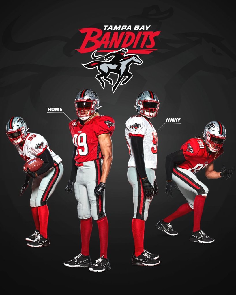
Colors - Red, Silver, Black
Another red team, eh? At least it's not red and gold. But then again, the Gamblers are also black, silver, and red. The inverse of the Bandits, I guess. Regardless, these colors go well together and don't look silly.
Score - 9
Uniforms

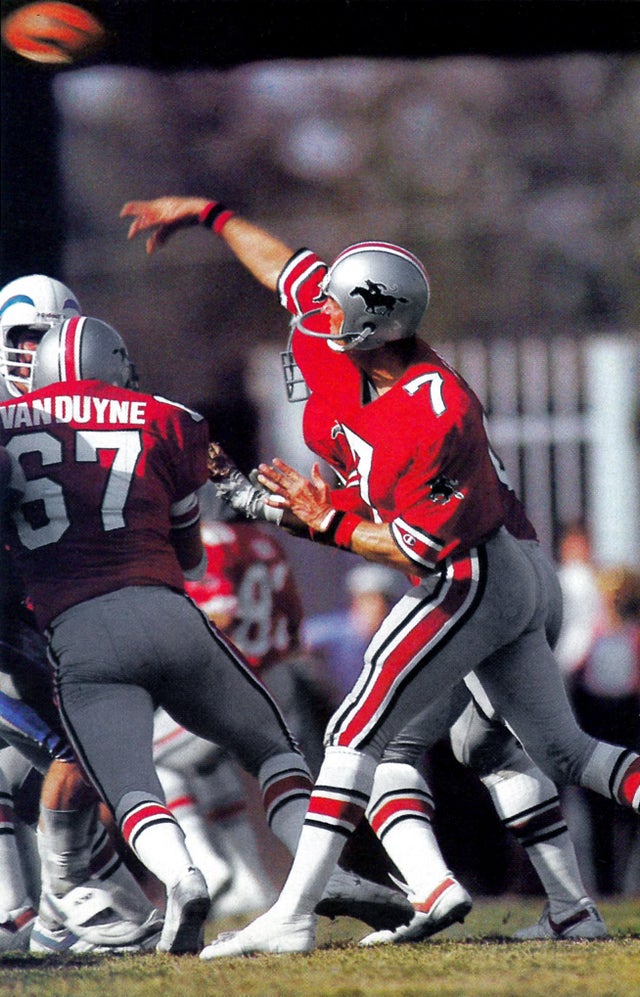
These are pretty sharp looking unis. They veered away from the old Ohio State look they used to have and made this design their own this go-round. I'm not very fond of the modern numbers, but the logo does look better in this modernized form.
Score - 7
Retro-Future

You can see how their old uniforms were basically the Ohio State Buckeyes with a logo. Sure, they're classic uniforms, but as someone who can't stand Ohio State, I'm glad to see them move away from that look. I would like to see some sleeve striping, or at least some socks that don't look like pantyhose. Overall, the new look is not really super tight with the old one, nor is it a total departure.
Score - 4
Total - 36 out of 50
Overall score comes down a bit from their lack of being similar to the old ones, but I think that's actually BETTER considering how much I hate the Buckeyes.


